Contrary to popular belief, stark white walls are often a poor choice for creating a restful bedroom, as their high light-reflecting properties can disrupt your body’s natural sleep cycle.
- High Light Reflectance Value (LRV) in white paints amplifies blue light, suppressing melatonin production.
- The psychological impact of color goes beyond hue to include its finish and interaction with lighting, which can increase stress hormones like cortisol.
Recommendation: To foster genuine tranquility, focus on “low-arousal” colors with complex undertones and matte finishes that absorb light rather than reflecting it.
Many homeowners striving for a serene, minimalist sanctuary default to a seemingly safe choice: crisp, white walls. The conventional wisdom suggests that white is a blank canvas, promoting a sense of calm and cleanliness. It feels intuitive, a simple path to a peaceful vibe after a hectic day. We associate it with purity and simplicity, assuming it will quiet the mind and prepare us for rest. However, this common design choice might be the very thing undermining our efforts to create a truly restorative environment.
What if the key to a tranquil home isn’t found in the simplicity of a single color, but in the complex science of how our eyes and brains process light, texture, and tone? The problem often lies not in the color itself, but in its unseen physical properties. The belief that “white is calming” ignores the powerful physiological mechanisms at play. The truth is, certain whites can be incredibly stimulating, creating a high-arousal environment that keeps your nervous system on alert exactly when it needs to wind down.
This article will deconstruct the myth of the universally calming white wall. We will delve into the science of color psychology, moving beyond simple color-mood associations to explore the crucial roles of light reflectance, paint finish, and strategic color transitions. By understanding these principles, you can transform your living spaces from sources of subconscious stress into environments that actively support your psychological and biological well-being.
To navigate these concepts effectively, this guide breaks down the core principles of using color to regulate your home’s atmosphere. You will discover how to select paints based on their physical properties, correct common design mistakes, and design rooms that genuinely reduce anxiety.
Summary: Why That ‘Calm’ White Bedroom Might Be Secretly Sabotaging Your Sleep
- Why Blue Light from Paint Pigments Affects Your Circadian Rhythm?
- How to Use “Low-Arousal” Colors to Calm Hyperactive Children?
- Matte vs. Satin: Which Finish Creates a Softer Psychological Atmosphere?
- The “Grey Room” Trend That Can Trigger Seasonal Affective Disorder
- How to Create a “Decompression Transition” Hallway Using Color Gradients?
- Why Overhead Lighting Increases Your Cortisol Levels in the Evening?
- How to Edit Green Tones So They Don’t Look Radioactive?
- How to Design a Living Room That Reduces Anxiety Levels After a Long Workday?
Why Blue Light from Paint Pigments Affects Your Circadian Rhythm?
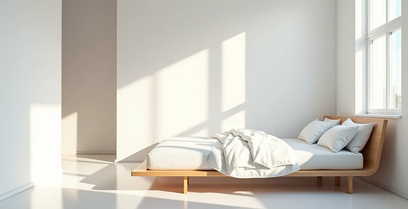
The primary issue with stark white paint in a bedroom isn’t its color, but its physics. Every paint has a Light Reflectance Value (LRV), a measure of how much light it reflects. Pure, brilliant whites have an extremely high LRV, often bouncing back the vast majority of light that hits them. According to industry data, stark white paints have an LRV between 85% and 95%. This turns your walls into giant reflectors, amplifying all light sources in the room, including ambient daylight in the evening and artificial lighting.
This intense reflection is problematic because of its interaction with our biology. Light, especially light in the blue-violet end of the spectrum, is a powerful signal to our brain to stay awake. When high-LRV white walls reflect this blue light—whether from screens, LED bulbs, or the evening sky—they effectively tell your brain it’s still daytime. This exposure suppresses the production of melatonin, the hormone responsible for regulating sleep.
The pigment most responsible for the brilliant, reflective quality of modern white paints is titanium dioxide. While excellent for creating opaque coverage, its formulation is designed for maximum light scattering, which inadvertently enhances the blue light effect. Essentially, by choosing a high-LRV white, you are creating an environment that works directly against your body’s natural circadian rhythm, making it harder to fall asleep and reducing sleep quality.
How to Use “Low-Arousal” Colors to Calm Hyperactive Children?
The concept of managing environmental stimulation is particularly critical in spaces for children, especially those prone to hyperactivity. High-contrast, high-energy environments can elevate a child’s arousal levels, making it difficult to focus or relax. The goal is to create a “low-arousal” space using colors that reduce cognitive load. This principle extends beyond just paint on walls; a meta-analysis has shown that diet plays a role, with an estimated 8% of children with ADHD being affected by artificial food colors, highlighting the sensitivity of their systems to chemical and visual stimuli.
Low-arousal colors are typically characterized by two main qualities: low saturation (they are muted or “dusty”) and low contrast with their surroundings. Instead of a bright primary color against a white trim, a low-arousal scheme would use soft, complex colors like sage green, dusty rose, or warm terracotta. These colors are less demanding on the visual system, allowing the brain to relax rather than constantly process intense information.
The key is to think in terms of an entire color story rather than a single accent wall. Analogous color schemes, which use colors that sit next to each other on the color wheel (like soft blues and greens), create a harmonious and cohesive feel. These desaturated earth tones and muted pastels provide a sense of safety and predictability, signaling to a child’s nervous system that it’s time to calm down. This is crucial in bedrooms and play areas where a transition from high-energy play to quiet rest is desired.
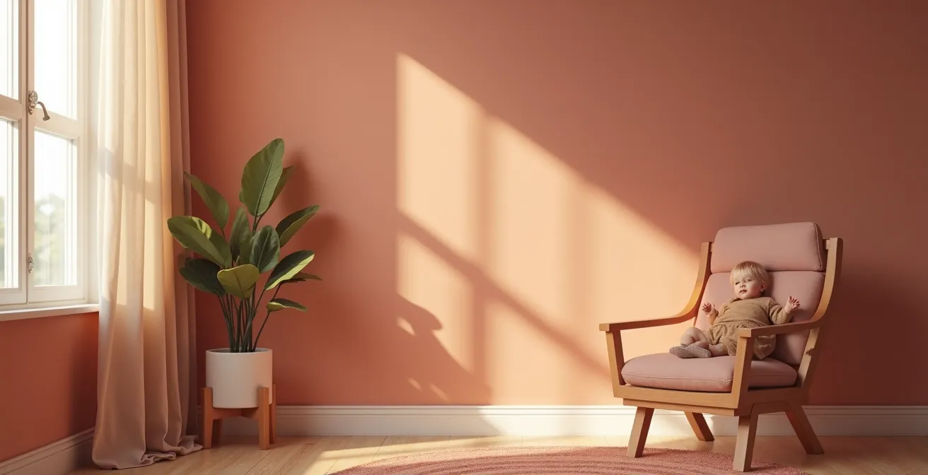
As this visual demonstrates, the layering of soft, muted earth tones creates a gentle and non-stimulating atmosphere. The absence of harsh contrasts allows the eye to rest, which in turn helps to soothe an overactive mind, making it an ideal strategy for creating a peaceful retreat for children.
Matte vs. Satin: Which Finish Creates a Softer Psychological Atmosphere?
The psychological effect of a color is not determined by its hue alone; the paint’s finish plays an equally important role in shaping a room’s atmosphere. The primary difference between finishes like matte and satin lies in how they reflect light. This distinction directly impacts our perception of a space, making it feel either soft and intimate or hard and sterile.
A matte finish creates what is known as diffuse reflection. It scatters light in all directions, which prevents the formation of “hotspots” or glare. This soft, absorbent quality makes walls feel almost like fabric, reducing visual noise and creating a cozy, enveloping sensation. This type of finish is ideal for bedrooms and living rooms where comfort and relaxation are the primary goals. In contrast, a satin or gloss finish produces specular reflection, bouncing light in a single, focused direction. This creates sharp points of light and defined reflections, making a surface appear harder, slicker, and more formal. While useful for highlighting architectural details on trim, it can create a visually busy and sterile environment when used on large wall surfaces.
Case Study: The Impact of Finish on Light and Atmosphere
Diamond Vogel’s architectural division analyzed how paint finishes affect interior spaces. Their study confirmed that matte finishes, by creating diffuse reflection, help achieve an intimate atmosphere without the visual disruption of specular hotspots found in glossier finishes. Their findings highlight that when aiming for a cozy feel, particularly in rooms with colors having an LRV below 50 (which absorb more light), a matte finish is essential to prevent the space from feeling both dark and harsh simultaneously.
This comparative table clearly outlines the different properties and their resulting psychological effects, sourced from an analysis of light-scattering pigments.
| Property | Matte Finish | Satin Finish |
|---|---|---|
| Light Reflection Type | Diffuse (scattered) | Specular (focused) |
| Visual Perception | Soft, absorbent, fabric-like | Harder, slicker surface |
| Glare Hotspots | None | Creates focal points |
| Psychological Association | Comforting, cozy | Formal, sterile |
| Best Application | Walls and ceilings | Trim and details only |
The “Grey Room” Trend That Can Trigger Seasonal Affective Disorder
For years, grey has been the go-to neutral, celebrated for its sophistication and versatility. However, the trend of creating all-grey rooms, especially with cool-toned greys, can have a significant negative psychological impact. These monochromatic, low-light environments can mimic the perpetual gloom of an overcast day, which for some individuals can be a trigger for low mood or even symptoms associated with Seasonal Affective Disorder (SAD).
The problem with a purely grey room is its lack of chromatic energy. Color provides vital psychological nourishment, and a space devoid of it can feel draining and oppressive. Color psychology research from the Sleep Foundation notes that dark, joyless colors can have a profound effect on our emotional state, finding that black, a color often related to dark greys, strongly correlates with feelings of depression, sadness, and fear. When a room lacks warmth and varied tones, our brains can interpret it as a lifeless, uninspiring environment, which can exacerbate feelings of lethargy and melancholy.
Cool greys, in particular, often have blue or green undertones that absorb light and can make a room feel cold and clinical. Without balancing elements, an all-grey interior can become a sensory deprivation chamber of sorts, starving the senses of the warmth and vitality needed for a positive mental state. The key to using grey successfully is to treat it as a backdrop, not the main event, and to layer it with warmth and texture.
Rescue Guide for an Existing Grey Room
- Identify Undertones: Place a pure white object against your grey wall in natural light. This will reveal if your grey leans cool (blue/purple) or warm (yellow/beige).
- Inject Warmth with Wood: Introduce furniture and decor pieces in warm wood tones like oak, walnut, or acacia to counteract the cool grey.
- Layer with Texture: Add chunky knit throws, velvet cushions, and plush rugs in warm, rich colors like ochre, rust, or deep burgundy to add physical and visual warmth.
- Bring in Life with Accents: Use accent colors with high chromatic energy, such as deep forest green or a splash of sunny yellow in artwork or accessories, to break the monotony.
- Change Your Bulbs: Replace cool white (4000K+) LED bulbs with warm white (2700K) options. This single change can dramatically shift the room’s entire emotional temperature.
How to Create a “Decompression Transition” Hallway Using Color Gradients?
The journey from the outside world to your personal sanctuary is a critical psychological process. A hallway or entryway should not be a mere passageway but a “decompression zone” that helps you shed the stress of the day. Using color gradients is a sophisticated design technique to facilitate this transition, guiding you mentally from a state of high alert to one of relaxation before you even enter your main living space or bedroom.
The concept involves starting with a more neutral, perhaps slightly cooler or more complex, color at the front door and gradually shifting to a warmer, softer, or more serene color as you approach the private areas of your home. This can be achieved through a subtle ombré effect on a long wall or by painting successive walls or doorways in progressively calmer shades. For example, a hallway might start with a complex greige and transition into a soft, warm beige or a dusty terracotta near the bedroom door.
This gradual shift in color serves as a non-verbal cue to your brain. It signals a change in environment and purpose, moving from the public, functional space to the private, restorative one. The visual flow guides your mindset, creating a deliberate ritual of “coming home” that goes beyond simply walking through a door. It’s an architectural tool for mindfulness.
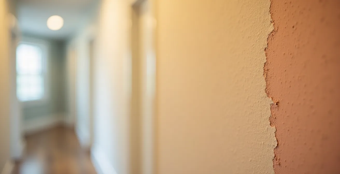
The power of this technique lies in its subtlety. It’s not about dramatic color changes but about a seamless, almost imperceptible flow that your subconscious registers as a journey toward calm. As Tash Bradley, a leading color psychologist, explains, creating a restful environment is foundational for good sleep.
Creating a calming environment is essential for good rest, so it feels pretty intuitive that choosing soothing bedroom paint ideas could aid in getting a better night’s sleep.
– Tash Bradley, Lick’s Director of Interior Design and color psychologist
Why Overhead Lighting Increases Your Cortisol Levels in the Evening?
One of the most common design flaws in modern homes is the over-reliance on a single, central overhead light fixture. This type of lighting, often called “top-down lighting,” is inherently stressful in the evening because it mimics the midday sun, the most intense light our ancestors would have experienced. This triggers a primal, physiological response in our bodies, increasing the production of cortisol, the primary stress hormone.
Cortisol follows a natural daily rhythm: it’s highest in the morning to wake us up and gradually decreases throughout the day, reaching its lowest point at night to allow for sleep. When you flood a room with bright, overhead light in the evening, you are sending a confusing signal to your adrenal system. Your brain interprets this intense, top-down illumination as a reason to stay alert and vigilant, artificially keeping your cortisol levels elevated.
This problem is severely exacerbated in rooms with high-LRV white walls and ceilings. A white ceiling essentially becomes an “artificial sun,” as described by painting professionals at Shoreline Painting in their analysis of residential projects. Their experience shows that this combination creates significant glare and a “squinting effect,” which further contributes to a state of arousal and prevents the body from winding down. Instead of creating a relaxing atmosphere, this lighting setup keeps your nervous system in a state of low-grade stress, hindering relaxation and disrupting the natural hormonal cascade needed for restful sleep.
How to Edit Green Tones So They Don’t Look Radioactive?
Green is instinctively calming to the human eye. As the dominant color in the natural world, it signals safety, life, and abundance. However, translating this tranquility into an interior space is not as simple as picking any shade of green. The wrong green—one that is too pure, too bright, or has the wrong undertones—can look artificial and jarring, or even “radioactive,” creating a sense of unease rather than peace.
The key to selecting a calming green is to look to nature’s blueprint. Natural greens are rarely pure; they are complex and desaturated. Think of the greyish-green of sage, the deep, earthy green of moss, or the muted, yellowish-green of olive. These greens are inherently sophisticated because they are mixed with other colors—browns, greys, and yellows. This complexity makes them feel authentic and grounding.
To avoid a “radioactive” look, you must edit your green. If you find a green you like that feels too vibrant, the solution is often to desaturate it by adding a tiny amount of its complementary color, red. This may sound counterintuitive, but a touch of red will neutralize the green’s intensity, making it feel more organic and less synthetic. Furthermore, lighting is crucial. Use bulbs with a high Color Rendering Index (CRI) of 90 or above. Low-CRI bulbs can fail to render the complex undertones in a sophisticated green, making it appear flat and artificial.
Key Takeaways
- Stark white paint’s high Light Reflectance Value (LRV) can disrupt sleep by suppressing melatonin production.
- Paint finish is as important as color; matte finishes create a softer, more relaxing atmosphere by diffusing light.
- Monochromatic grey rooms can trigger low moods by lacking chromatic energy; they need warmth and texture to feel balanced.
How to Design a Living Room That Reduces Anxiety Levels After a Long Workday?
After a long workday, your living room should be a haven for mental recovery, a space that actively helps lower anxiety. Designing for anxiety reduction involves more than just aesthetics; it’s about creating an environment that supports our innate psychological needs for safety, calm, and connection to nature. This approach, known as biophilic design, integrates natural elements and patterns into our built environments to reduce stress and improve well-being.
The core principle is to reduce cognitive load and create a sense of “prospect and refuge.” This means having open sightlines (prospect) so you feel aware of your surroundings, combined with cozy, protected nooks (refuge) where you can retreat and feel secure. A large, open-plan living room can feel anxiogenic if it’s just a vast, empty space. Creating zones with area rugs, a comfortable armchair in a corner, or a sectional sofa that “hugs” you can provide that essential feeling of refuge.
Lighting should be layered and kept below eye level in the evenings. Instead of a single, harsh overhead light, use a combination of floor lamps, table lamps, and sconces to create pools of warm, inviting light. This mimics the gentle, low-level light of a sunset or campfire, signaling to your brain that it’s time to relax. Finally, material choices matter. Incorporating natural materials like wood, stone, wool, and linen creates a tactile, grounding connection to the natural world, which has a demonstrably calming effect on the nervous system.
The following table breaks down key biophilic design elements that can be applied to a living room to help reduce anxiety.
| Design Element | Natural Analog | Psychological Effect |
|---|---|---|
| Color Palette | Blues, greens, earthy browns | Reduces heart rate and blood pressure |
| Spatial Layout | Open sightlines with cozy nooks | Provides both prospect and refuge |
| Visual Complexity | Low-contrast analogous colors | Reduces cognitive load |
| Light Sources | Multiple levels below eye height | Mimics natural evening light |
| Material Choices | Natural wood, stone, fabrics | Creates grounding sensory connection |
By shifting your focus from simple color-mood equations to the underlying science of light, finish, and biophilic patterns, you can make informed choices that turn your home into a genuine sanctuary that supports your mental and physical health. The next step is to assess your own spaces not for how they look, but for how they make you feel, and begin making small, impactful changes.